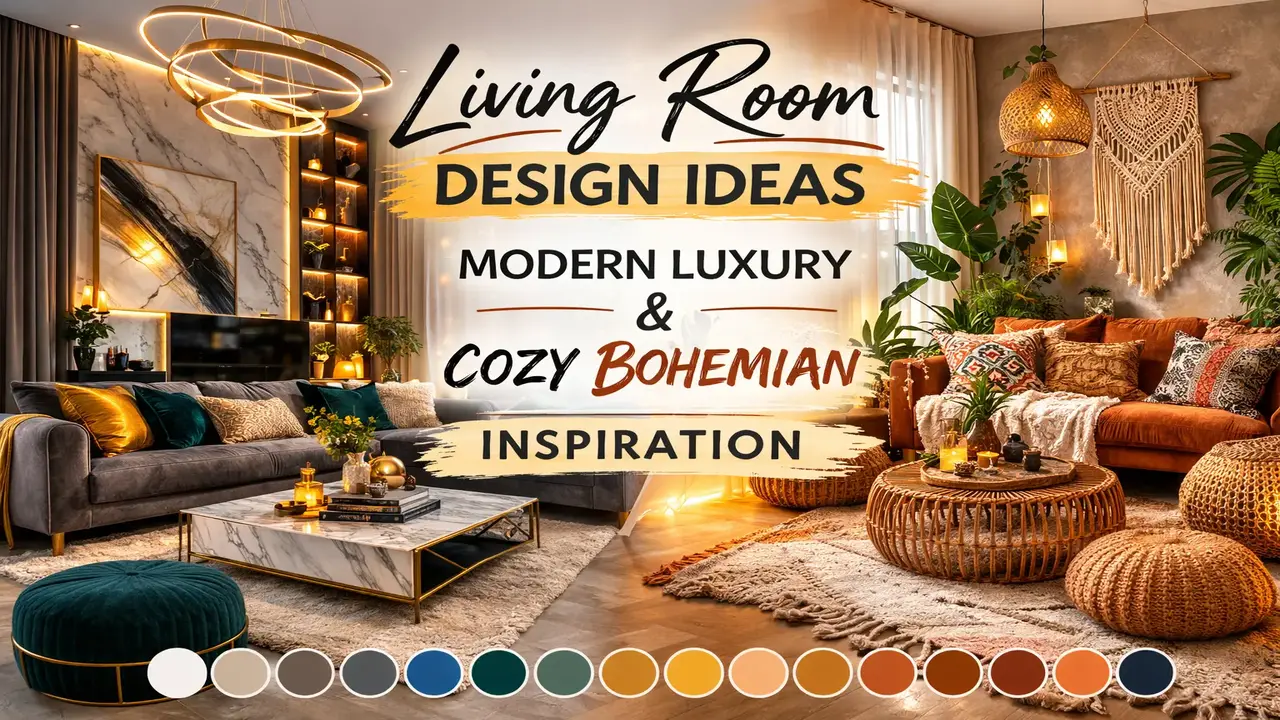
Living Room Design Ideas: Modern Luxury & Cozy Bohemian Inspiration
Discover curated color schemes that bring sophistication, modernity, and warmth to your living room — from sleek industrial luxury to cozy bohemian charm.
Design 1: Modern Luxury with Cool Blue Accents
The Vision
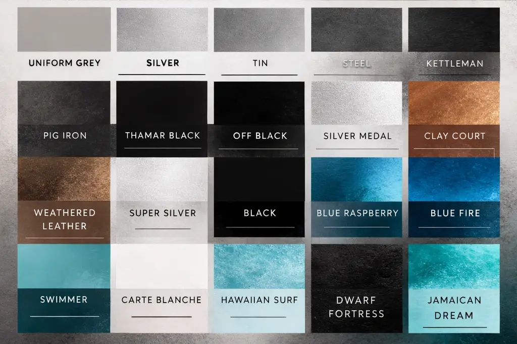
A sophisticated living room design graphic showcasing a modern, luxury-inspired interior with a curated palette of 20 dominant colors. This design blends elegant neutrals like Uniform Grey, Silver, Tin, Steel, and Kettleman with deep accents such as Thamar Black, Pig Iron, and Off Black. Rich warmth comes through Clay Court and Weathered Leather, while bold blue tones like Blue Raspberry, Blue Fire, Swimmer, Hawaiian Surf, and Jamaican Dream add a refreshing contemporary touch.
Why This Palette Works
This color scheme thrives on contrast and balance. The grey-scale foundation creates a polished, high-end atmosphere that feels timeless without being boring. The deep black accents — Thamar Black and Pig Iron — anchor the space with dramatic weight, perfect for statement furniture pieces, feature walls, or matte-finish cabinetry.
What truly elevates this palette is the injection of vivid blues. Colors like Blue Fire and Hawaiian Surf aren’t just decorative — they’re energizing. When placed against a neutral grey backdrop, these blues become focal points that draw the eye and create visual rhythm across the room.
Meanwhile, the warmer tones of Clay Court and Weathered Leather prevent the space from feeling cold or sterile. Think leather accent chairs, wooden side tables, or terracotta decorative bowls that ground the room with organic warmth.
How to Use This Palette in Your Living Room
- Walls & Ceiling: Uniform Grey or Silver for a clean, airy base
- Large Furniture (Sofa, Sectional): Steel or Kettleman for understated elegance
- Accent Furniture: Thamar Black or Off Black for a bold anchor
- Throw Pillows & Textiles: Blue Raspberry, Swimmer, and Hawaiian Surf for pops of color
- Decorative Accessories: Clay Court and Weathered Leather for warmth — think ceramic vases, woven baskets, and leather trays
- Metallic Finishes: Tin and Pig Iron tones in light fixtures, hardware, and frames
Best Suited For
- Modern living rooms
- Minimalist interiors
- Industrial décor themes
- Cool-toned home styling
- Urban loft apartments
- Contemporary open-plan spaces
Save this palette for interior design ideas, home color schemes, and contemporary living room inspiration.
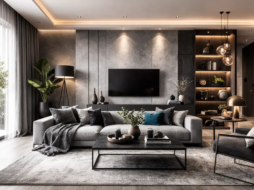
Design 2: Refined Industrial Elegance with Vibrant Blue Energy
The Vision
A sophisticated living room design graphic showcasing a modern, luxury-inspired interior with a curated palette of 20 dominant colors. The design blends elegant neutrals like Uniform Grey, Silver, Tin, Steel, and Kettleman with deep tones such as Pig Iron, Thamar Black, and Off Black. Warm accents like Clay Court and Weathered Leather add balance, while vibrant blues including Blue Raspberry, Blue Fire, Swimmer, Hawaiian Surf, and Jamaican Dream bring a bold contemporary touch.
Why This Palette Works
At first glance, Design 2 shares DNA with Design 1 — and that’s intentional. The subtle shift in emphasis and arrangement transforms the overall feel. Here, the deep tones take a slightly more prominent role, giving the room a moodier, more intimate atmosphere. Think of a living room designed for evening gatherings, where low lighting catches the sheen of metallic surfaces and deep charcoal walls create a cocoon-like comfort.
The warm accents are positioned as balancing agents rather than secondary touches. Clay Court might appear as a statement rug or a large piece of wall art, while Weathered Leather could define the primary seating — a worn-in leather Chesterfield sofa, for instance, that becomes the heart and soul of the room.
The vibrant blues in this arrangement feel bolder and more intentional. Jamaican Dream, with its deep oceanic richness, could be the color of a velvet armchair or a lacquered coffee table. Hawaiian Surf might appear in abstract artwork or decorative glass pieces on open shelving.
How to Use This Palette in Your Living Room
- Feature Wall: Pig Iron or Off Black for dramatic depth
- Remaining Walls: Uniform Grey or Silver for contrast and light reflection
- Primary Sofa: Weathered Leather tone — genuine or faux leather in a warm brown
- Secondary Seating: Steel or Kettleman upholstery
- Statement Accent Chair: Jamaican Dream or Blue Fire in velvet
- Throw Blankets & Cushions: Mix of Blue Raspberry, Swimmer, and Clay Court
- Shelving & Storage: Thamar Black matte-finish units
- Lighting Fixtures: Tin or Silver metallic pendants and floor lamps
- Rug: Layered textures in Kettleman and Steel tones
- Art & Accessories: Abstract pieces incorporating the full blue spectrum
Design Pro Tips
- Layer your lighting. A moody palette like this demands multiple light sources — floor lamps, table lamps, recessed lighting, and candles. Avoid relying on a single overhead fixture.
- Mix textures aggressively. When your color palette leans neutral, texture becomes your best friend. Combine matte, gloss, leather, linen, velvet, metal, and wood within the same space.
- Use blue strategically. Rather than scattering blue across every surface, concentrate it in two or three impactful places. This creates intentional focal points rather than visual chaos.
Best Suited For
- Modern living rooms with an edge
- Minimalist interiors with personality
- Industrial décor with refined touches
- Cool-toned home styling
- Bachelor pad aesthetics
- Media rooms and entertainment spaces
Save this palette for home color schemes, interior design planning, and contemporary living room ideas.
Design 3: Cozy Bohemian Living Room with Earthy Desert Tones
The Vision
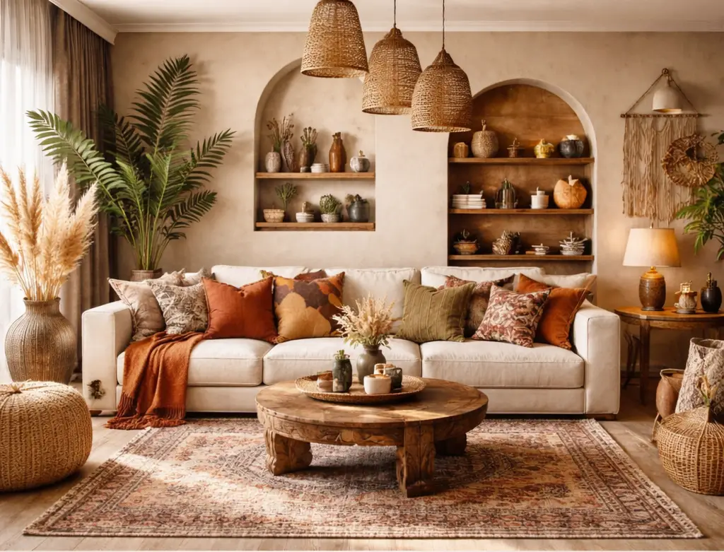
A cozy bohemian living room design featuring warm, earthy tones and natural textures paired with a curated 20-color palette. The space showcases a neutral linen sofa layered with terracotta, rust, ochre, and olive-toned cushions, complemented by woven pendant lights, wooden shelving, indoor plants, and a vintage-style patterned rug.
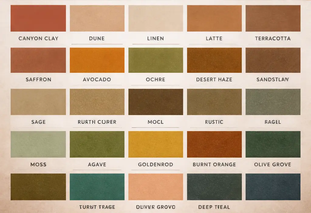
The palette highlights rich desert-inspired hues such as Canyon Clay, Terracotta, Saffron, Ochre, Burnt Orange, Sage, Moss, Olive Grove, Deep Teal, and Goldenrod — perfect for creating a warm, organic, and inviting home atmosphere.
Why This Palette Works
This is the antithesis of cold minimalism — and that’s exactly the point. The bohemian palette draws from nature’s most comforting colors: the warm reds and oranges of desert canyons, the greens of forest undergrowth, the golden yellows of late afternoon sunlight filtering through linen curtains.
What makes this palette particularly effective is its tonal harmony. Every color belongs to the same warm family, which means you can mix and layer freely without fear of clashing. Canyon Clay next to Burnt Orange next to Saffron next to Goldenrod — they all sing together because they share underlying warm undertones.
The green tones — Sage, Moss, Olive Grove, and Deep Teal — serve as the perfect complementary counterpoint. In color theory, greens and teals sit opposite oranges and reds on the color wheel, creating natural visual interest without tension. These greens also connect the indoor space to the natural world outside, especially when paired with real indoor plants.
How to Use This Palette in Your Living Room
- Sofa: Neutral linen or natural cotton in cream, oatmeal, or sand
- Cushion Layer 1: Terracotta and Canyon Clay — the dominant accent colors
- Cushion Layer 2: Ochre and Saffron — adding golden warmth
- Cushion Layer 3: Sage and Olive Grove — introducing natural greens
- Throw Blanket: Burnt Orange or Rust in a chunky knit or woven texture
- Rug: Vintage-style patterned rug incorporating Terracotta, Goldenrod, and Deep Teal
- Lighting: Woven rattan or bamboo pendant lights in natural tones
- Shelving: Warm-toned wood (walnut, oak, or reclaimed timber)
- Plants: Abundant indoor greenery — fiddle leaf figs, pothos, snake plants, trailing ivy
- Wall Color: Warm white or the lightest Sage for a soft, enveloping feel
- Accent Wall or Archway: Canyon Clay or Terracotta for bold bohemian drama
- Decorative Objects: Ceramic vases in Moss and Ochre, woven baskets, dried pampas grass, brass candle holders
Key Elements of Bohemian Living Room Design
Natural Materials Are Non-Negotiable. Boho style is rooted in authenticity. Choose real wood, genuine leather, natural fibers (jute, cotton, linen, wool, rattan), and handmade ceramics wherever possible. Mass-produced plastic and high-gloss finishes will break the spell.
Layering Is Everything. A bohemian room should feel collected over time, not purchased in a single shopping trip. Layer rugs over rugs. Stack cushions of different sizes. Drape throws casually over armrests. Hang textiles on walls. The more layers, the cozier and more authentic the space feels.
Embrace Imperfection. The beauty of boho design lies in its relaxed, lived-in quality. A slightly faded vintage rug is more beautiful than a brand-new one. A hand-thrown ceramic pot with visible fingerprints tells a story. Reclaimed wood with visible grain and knots adds character that polished furniture never could.
Bring the Outdoors In. Plants aren’t optional in bohemian design — they’re essential. They add life, color, texture, and even improve air quality. Group them in clusters at varying heights: tall floor plants, medium plants on shelves, small trailing plants in hanging macramé planters.
Design Pro Tips
- Start with the rug. In boho design, the rug often sets the entire color direction. Find a vintage or vintage-style rug you love, then pull your cushion, throw, and accessory colors from it.
- Mix patterns confidently. Boho rooms thrive on pattern mixing — stripes with florals, geometric with paisley, ikat with tribal prints. The key is maintaining a consistent color palette across all patterns.
- Add personal artifacts. Travel souvenirs, family heirlooms, flea market finds, and handmade items give a bohemian room its soul. Don’t shy away from displaying objects that tell your personal story.
- Use warm-toned lighting. Swap cool white bulbs for warm white (2700K–3000K). The golden light enhances every warm tone in the palette and creates the inviting ambiance that defines boho living.
Best Suited For
- Bohemian interiors
- Earthy home décor
- Rustic styling
- Nature-inspired living rooms
- Eclectic and collected interiors
- Cottage and farmhouse-adjacent spaces
- Creative studios and artistic homes
Save this palette for boho interior inspiration, earthy color schemes, and nature-inspired living room design.
How to Choose the Right Palette for Your Living Room
With three dramatically different design directions in front of you, how do you decide? Here are some guiding questions:
Consider Your Lifestyle
- Do you entertain frequently? Designs 1 and 2 project sophistication that impresses guests.
- Do you prioritize comfort and relaxation? Design 3’s bohemian warmth is hard to beat.
- Do you have children or pets? Earthy tones and textured fabrics (Design 3) hide wear and stains better than light greys.
Consider Your Architecture
- Modern apartment or loft? Designs 1 and 2 complement contemporary architecture beautifully.
- Older home with character? Design 3’s bohemian warmth enhances original features like exposed brick, wooden beams, or arched doorways.
- Open-plan living? Any palette works, but ensure your chosen colors flow naturally into adjacent kitchen and dining areas.
Consider Your Natural Light
- North-facing rooms (limited light)? Design 3’s warm tones compensate for cool, low light. Avoid the darker elements of Design 2.
- South-facing rooms (abundant light)? All three palettes work beautifully with generous natural light.
- East or west-facing rooms? Consider how morning or afternoon light will shift the appearance of your chosen colors throughout the day.
Consider Your Existing Pieces
Few people start from a completely blank canvas. If you already own a significant piece — a sofa, a dining table, a piece of art — choose the palette that best incorporates what you have. Working with existing pieces rather than against them saves money and creates a more authentic, collected look.
Final Thoughts: Color Is the Foundation of Great Design
Whether you’re drawn to the sleek, cool sophistication of the industrial-luxury palettes or the warm, textured embrace of bohemian earth tones, remember that a thoughtfully chosen color palette is the foundation upon which every other design decision rests.
Start with color. Let it guide your furniture choices, your textile selections, your lighting decisions, and your accessory curation. When every element in a room speaks the same color language, the result isn’t just a well-designed space — it’s a space that feels right the moment you walk in.
Save these palettes. Pin them. Screenshot them. Return to them. Because the best living rooms aren’t designed in a day — they’re built color by color, layer by layer, piece by piece, until the space tells a story that’s unmistakably yours.
You Might Like: More Design Ideas
Looking for more interior design inspiration, home color schemes, and room design ideas? Explore our full collection of curated design palettes and styling guides to find the perfect look for every room in your home.
FAQs
1. How do I choose the right color palette for my living room?
Decide the mood you want—cool neutrals for a modern look or warm earth tones for a cozy feel—then match it with your lighting and furniture.
2. Can I mix modern luxury and bohemian styles?
Yes. Combine clean modern furniture with warm textures and earthy accents for balance.
3. What are good accent colors for a modern living room?
Bold blues and deep blacks add contrast, depth, and a contemporary touch.
4. How do I make my living room cozy without making it dark?
Use warm accents and soft textures while keeping walls and large furniture in lighter shades.
5. What defines a bohemian living room style?
Natural materials, layered textiles, earthy colors, and plenty of plants.